How Split Testing your CTA will Increase Conversions
A call to action (CTA) is an integral piece of any marketing strategy, whether you’re looking at landing pages, pop-up ads or email newsletters. This is the bit that is the final piece of the puzzle in persuading the visitor or reader to take the action you want, whether that is making a purchase or signing up for more info.
Your CTA must be a strong driving force, but if you’re worried that it is not doing its job there is something you can do – a split test. This is a great way to assess how your CTA is performing and give you an insight into what you can do to improve it.
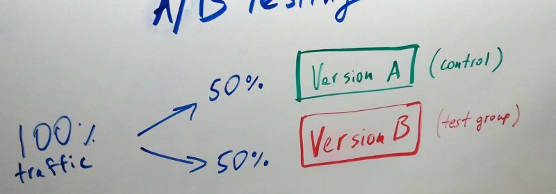
A split test simply means that you alter one variable, and one only, at a time. It can also be known as A/B testing. By altering only one aspect and comparing the data generated from the results you can fine-tune your CTA quite closely and ensure you are using the best one possible. It takes time but is well worth the effort – once you know which elements work best you can use these across all your CTAs.
So which variables should you test? Below are some ideas.
- Buttons vs Links
It can be difficult to make links stand out, so a button may be used on a CTA to make it more noticeable. The benefit of this is that you can then use colours, size and text to increase click-rate. But buttons can come across as a bit of a novelty, and a straightforward link might be more appropriate for more serious topics. - Click phrases
The traditional “click here” phrase may seem dull and out-dated, but it works! You might like to experiment with variations such as “click to continue”, “read more” or “continue to article”. - Colours
You probably use your brand colours throughout your marketing materials, but you might want to consider alternatives on CTAs that could bring better results. Red may seem a strange choice as it often signals stop, but it can also signal danger or limited-time, so may work very well on a CTAbutton. - Size and position
Bigger is not always better, and when combined with position and layout there can be huge differences in how size impacts results. Play around with layouts and see what works best – sometimes “in your face” can be too much and a more subtle approach might be better. - White space and images
Too much clutter can result in your CTA message being lost, so use white space and images carefully. It is also wise to consider the use of special effects carefully too – they can appear cheap.